In this tutorial, we will explore different layouts you can use when designing native mobile apps using Blazor and some tricks for how you can customize them to get just the look and feel your customers need.
ContentPage Layout
ContentPage is the default page layout when you create a new mobile Blazor bindings project from template. It is a full page view that you can add components like images, labels, buttons, checkboxes, and sliders to.

To create this view, your App.cs file may include something like the following.
MainPage = new ContentPage();
host.AddComponent<BlazorApp>(parent: MainPage);
The view contained in the BlazorApp class is loaded into a ContentPage page component assigned as MainPage.
To create the view above, use the following code in your BlazorApp.razor.
<ContentView>
    <StackLayout Margin="new Thickness(20)">
        <Label Text="Hello from wellsb.com"
               FontSize="36"
               HorizontalTextAlignment="TextAlignment.Center" />
        <Label Text="What is your name?"
               FontSize="16" />
        <Entry @bind-Text="name" />
        <Grid>
            <Layout>
                <RowDefinition GridUnitType="GridUnitType.Auto" />
                <ColumnDefinition GridUnitType="GridUnitType.Auto" />
                <ColumnDefinition GridUnitType="GridUnitType.Auto" />
            </Layout>
            <Contents>
                <GridCell Row="0" Column="1">
                    <Label Text="Are you a human?"
                           FontSize="16"
                           VerticalTextAlignment="TextAlignment.Center" />
                </GridCell>
                <GridCell Row="0" Column="0">
                    <CheckBox Color="Color.LightBlue"
                              @bind-IsChecked="isHuman" />
                </GridCell>
            </Contents>
        </Grid>
        <Label Text="How old are you?"
               FontSize="16"/>
        <Slider BackgroundColor="Color.LightBlue" ThumbColor="Color.DarkBlue"
                Minimum="0" Maximum="120"
                @bind-value="age"/>
        <Label Text=@($"Value: {(int)age}")
               HorizontalTextAlignment="TextAlignment.End"/>
    </StackLayout>
</ContentView>

@code {
    private bool isHuman = false;
    private double age;
    private string name;
}
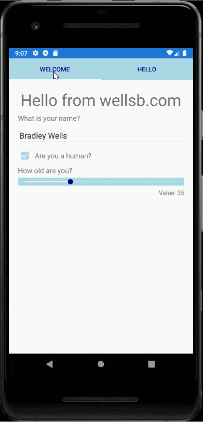
TabbedPage Layout
TabbedPage is another common page view layout for mobile apps. You might use this view when you have page components with a similar hierarchy level that your users may need to access.
Configure your application to use a TabbedPage view in your project's App.cs.
MainPage = new TabbedPage();
host.AddComponent<BlazorApp>(parent: MainPage);
For additional configuration options, you can set specific properties for your TabbedPage view.
MainPage = new TabbedPage()
{
    BarBackgroundColor = Color.LightBlue,
    BarTextColor = Color.DarkBlue
};
host.AddComponent<BlazorApp>(parent: MainPage);
Then, in BlazorApp.razor (or whatever component you add as your application's main layout component), add each tab as a top-level ContentPage with tab title set by the Title parameter.
<ContentPage Title="Welcome">
    <SampleForm />
</ContentPage>
<ContentPage Title="Hello">
    <HelloWorld />
</ContentPage>
To simplify code, and to take full advantage of the Blazor programming model, I added the form from the previous example to its own reusable razor component called SampleForm.
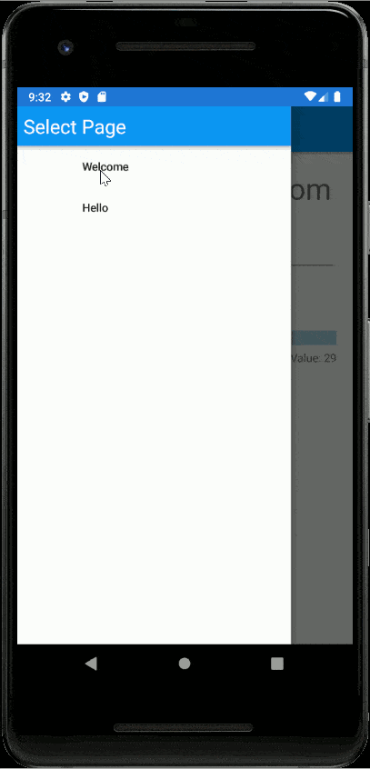
Shell Flyout Layout
The shell view is a specialized component that resembles a Master-Detail page layout with a flyout that links to child content pages.
To construct this view, instead of setting a MainPage layout as the parent for your BlazorApp component, simply set the app itself as parent in App.cs.
host.AddComponent<BlazorApp>(parent: this);
Then, in BlazorApp.razor, configure the Shell component with a FlyoutHeader (if desired) and list each of the child pages you wish to set up routes to.
<Shell>
    <FlyoutHeader>
        <Label Text="Select Page"
               TextColor="Color.White"
               Margin="8"
               FontSize="24" />
    </FlyoutHeader>
    <ChildContent>
        <ShellContent Route="welcome" Title="Welcome">
            <SampleForm />
        </ShellContent>
        <ShellContent Route="hello" Title="Hello">
            <HelloWorld />
        </ShellContent>
    </ChildContent>
</Shell>
Note that each of the render fragments within the ShellContent component must, themselves, be contained in a Page element, like a ContentPage.
<ContentPage>
    <StackLayout Margin="new Thickness(20)">
        <Label Text="Hello again"
               HorizontalTextAlignment="TextAlignment.Center"
               FontSize="36" />
        <Counter />
    </StackLayout>
</ContentPage>
The Bottom Line
In this tutorial, you experimented with three common mobile application layouts using Blazor bindings. In subsequent tutorial lessons, you will build on these layouts to create a full-featured, cross-platform, mobile application using the Blazor programming model. If you have any questions, let me know in the comments!
Don't stop learning!
There is so much to discover about C#. That's why I am making my favorite tips and tricks available for free. Enter your email address below to become a better .NET developer.
Did you know?
Our beautiful, multi-column C# reference guides contain more than 150 tips and examples to make it even easier to write better code.
Get your cheat sheets